ColorForward 2009 | Global Color Forecast and Trend Inspirations
Awareness of Global Connectedness and Environmental Responsibility Projected to Drive Consumer Colour Preferences
Strong feelings about increasing cultural unity and personal commitments to a better environment can be expected to make consumers more receptive to bright, layered colors, contrasted with earthy, neutral tones, according to the 2009 edition of ColorForwardâ„¢. This Clariant Masterbatches color trend analysis and design tool is released annually to help designers and marketing professionals make informed color choices. ColorForward 2009 is the collaborative effort of color specialists from North and South America, Europe and Asia. It is an invaluable service available through Clariant’s global network of ColorWorksâ„¢ design & technology centers.
Each year, the ColorForward team explores global cultural influences and lifestyle trends to gauge their impact on color directions for future consumer products. “These color forecasts are meant to be used as a guide, linking color preferences and social trends and showing how these relationships impact the path of color trends.” explains Carolyn Sedgwick, Clariant ColorWorks Business Manager. “ColorForward does not tell you what color to choose. Rather, its goal is to provide information and inspiration that can be interpreted, adapted and applied to suit individual marketing objectives and product requirements.”
The 2009 edition of ColorForward focuses on four key societal trends:
– Grow Your Own Future recognizes that people have begun to take personal responsibility for environmental issues, making positive changes to improve the world we share.
– Global Repositioning acknowledges the growing influence of Asian traditions and cultures as well as the enhanced cross-cultural connections made possible by the Internet and modern communications media.– Duality develops from the way in which people today accept and even celebrate multiple facets of their own personality, embracing opposing concepts and synthesizing different ideas and influences into a new whole.
– Mosaic reflects how strict global identities are loosening their hold on people, allowing enlightened intermingling of ideas and ethnic influences without losing unique cultural roots.
Linking Color to Cultural Trends
Once they identified the societal and mass-market concepts that can be expected to resonate with consumers in 2009, the ColorForward team considered how these ideas are likely to play out in color.
“People tend to respond well to colors that reflect the broader influences on their lives,” explains Cristina Carrara, ColorWorks Designer. “Since brand managers are working now on products and packaging that will be on the market in 2009 and beyond, we need to help them anticipate which colors will be most effective in gaining consumer attention a year or more from now. ColorForward 2009 identifies a total of 20 colors — four basic colors and one effect color for each of the four societal and lifestyle trends.”
To represent Mosaic, for instance, Clariant selected strong saturated hues including All Night Long dark blue, Pumpking orange and Leaping Leprechaun green. Carrara notes that each color is strong and independent, but works well when balanced with other colors in the global palette.
The Duplicity family includes both brilliant, vibrant colors and contrasting light, neutral shades. Here Carrara points to Isis, a very light blue/green that expresses a quiet state of mind, while Lolita is a vibrant, glossy, somewhat ironic fuchsia. Other colors in this group include Insomnia, a mysterious blue/purple, and Bosporus Dusk, a neutral light blue/lilac.The 2009 edition is the first ColorForward release to include special effects that incorporate non-color ingredients that add sparkle, reflectivity, depth and other qualities to enhance the base color. For instance, in the Mosaic group a pink pearlescent is added to white to yield an effect called Dessert, while the Duplicity effect color is called Velvet Fog. Carrara describes it as “a deep gray with purplish interference that seems translucent, but which develops more depth and character when viewed from a different angle.”
Clariant offers ColorForward seminars at the seven ColorWorks locations as well as at selected conferences and customer sites. The ColorForward social trend themes, images and color directions are also captured in a handsome booklet along with a set of polypropylene color chips to provide a tactile experience.
Clariant Masterbatches products are marketed under six global brand names: REMAFIN® masterbatches for olefins; RENOL® masterbatches for engineering resins, styrenics and PVC; CESA® additive masterbatches; HYDROCEROL® chemical foaming and nucleating agents; OMNICOLOR® universal color masterbatches; and ENIGMA® special effects. These brand names and ColorForwardâ„¢ and ColorWorksâ„¢ are all registered trademarks or trademarks of Clariant. More information on Clariant Masterbatches products is available at www.clariant.masterbatches.com.
https://www.clariant.com/en/Corporate/News/2016/01/Clariant-Presents-Colors-for-2017-in-the-Newest-Edition-of-ColorForward
Contact:
Laurie Reid, Clariant Masterbatches
Phone: +1-401-438-4080
Fax: +1-401-438-4680
laurie.reid@clariant.com
-
Services
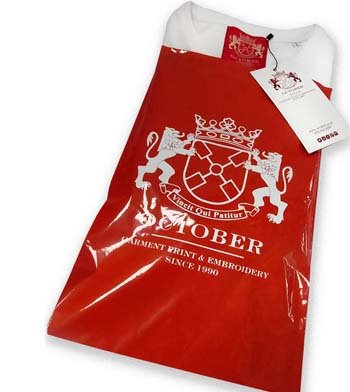
OUR SERVICES, WHAT CAN WE DO FOR YOU..?
- Artwork Origination
- Screen Printing
- Embroidery
- Relabelling
- Watch us print
- Bagging
- Garment manufacture
- Cap manufacture
- Digital Printing
- Design consultancy
- Garment Sourcing
- Fashion Photography
October is a t shirt printing, screen printing, garment sourcing and embroidery supplier established in 1990. We source a wide range of clothing and accessories to fit the most demanding of specifications. Although we print and embroider for a variety of sectors, our speciality is fashion.
With this in mind we offer a full service including garment sourcing, graphic design input, range development, technical screen print and embroidery advice, label supply, re-labelling, bagging, swing ticketing and bulk distribution.
October builds brands...
- Clients
-
Garment Store
Garment Store
- Menswear t-shirts
- Womenswear T-shirts
- Shorts and Trousers
- Sweats and Hoods
- Coats and Jackets
- Shirts and Polos
- Garment Sets
- Headgear
- Bags
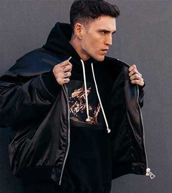
This isn't everything. That would just be too massive, but it is a cross section of all our favourite T-shirts, sweatshirts, hoods, polos, hats etc. It's what a pretentious bell end might call a curated edit. Feel free to call us with any questions, and let us know if we left anything out.
October builds brands...
-
Print methods
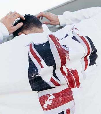
our print methods, which one is right for you..?
- Discharge inks
- water based inks
- Foil printing
- Glitter and shimmer printing
- Metalic printing
- Expanding ink printing
- Gloss printing
- Digital printing
- Litho transfer printing
- All over printed
- Black Tonal
- Discharge with foil printing
- Neon Printing
- Plastisol printing
Picking the right garment, the right printing ink, or the right embroidery thread, is a most tricky business.
If you would like us to make some garment suggestions, and advise on the best print or embroidery methods
October builds brands...
- Gallery
-
About Us
About Us
About October Textiles
It all started 25 years ago. Paul finished a degree in obscure eastern religions, and was surprised to find he couldn't get a job. Not a problem, a friend had a sewing machine,
October builds brands...
- Contact
