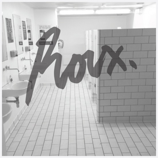
Just when you thought it was safe to go to the Gents…
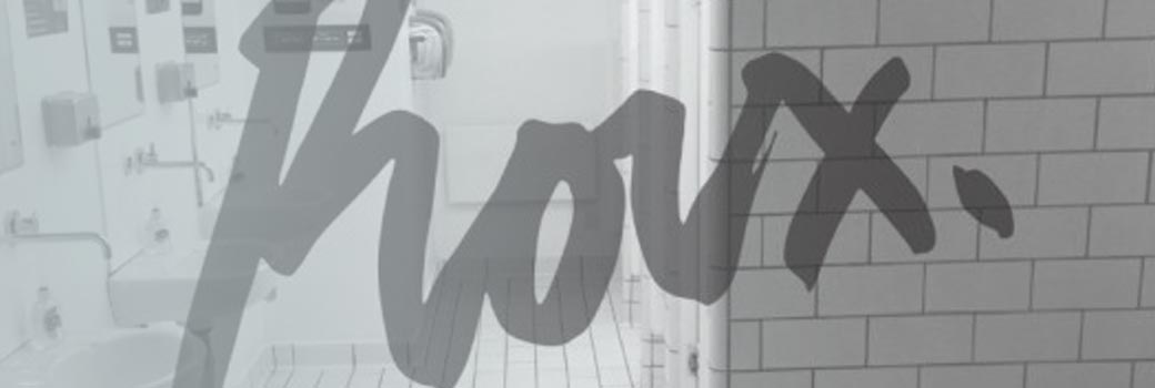
‘I’ve been fighting all sorts of thoughts and opinions on how to deliver it.
As much as I like a solid, block typeface, I’ve seen a bit of a shift away from it and the more it’s used the more I like it.
It maintains the italicised look, but as I said is softer and enough of a move away from the ‘old’ logo.
I’ve got pages and pages of hand drawn versions in the office, all using different materials, wax crayon, ink, paint, marker pens all which weren’t quite right…. in the end I used a little pot of ink, watered down slightly, and a small detail paint brush’ Greg White.
